Factory-direct LED Dome & Spherical Displays — Shenzhen, China
✉ enquiries@luminatii.com
☎ +86 177 0402 4640

Our dome screens run 1,200 nit with 10,000:1 contrast and 16-bit gray — and any competitor can print a bigger nits number. What decides whether a dome looks cinematic is how brightness, contrast and gray depth work together inside a dark sphere.
Ask three dome suppliers for their brightness and you will get three nits numbers. Ask them what the black level looks like, and the conversation changes — because in a dome, the audience spends most of its time looking at darkness. A starfield is 95% black. A night flight over a city is mostly black. Brightness without contrast and gray depth produces a screen that is loud in daylight scenes and dead in the scenes domes are actually built for.
| Parameter | Our delivered specification | What the audience experiences |
|---|---|---|
| Screen brightness | 1,200 nit | Daylight scenes with headroom; the dome reads as bright without requiring blackout architecture |
| Contrast ratio | 10,000:1 | Deep blacks behind small bright features — stars, city lights, bioluminescence |
| Gray depth | 16-bit processing | Smooth gradients instead of visible banding across skies and nebulas |
| Uniformity | Brightness deviation ≤ 5% | No visible hot or dull patches when the eye sweeps the sphere |
| Colour accuracy | ≤ 2ΔE deviation | Content looks the way the colourist graded it, across the whole surface |
Those five rows are one system. A screen that wins on row one and loses on rows three to five produces the familiar complaint: bright, but it looks like a screen. The dome that gets all five right is the one audiences describe as being there. How we hold uniformity and colour →
A dome is an enclosed light environment. The audience walks in from daylight, sits in a dim room, and their eyes adapt over several minutes. That adaptation is why dome brightness cannot be specified the way an outdoor billboard is.
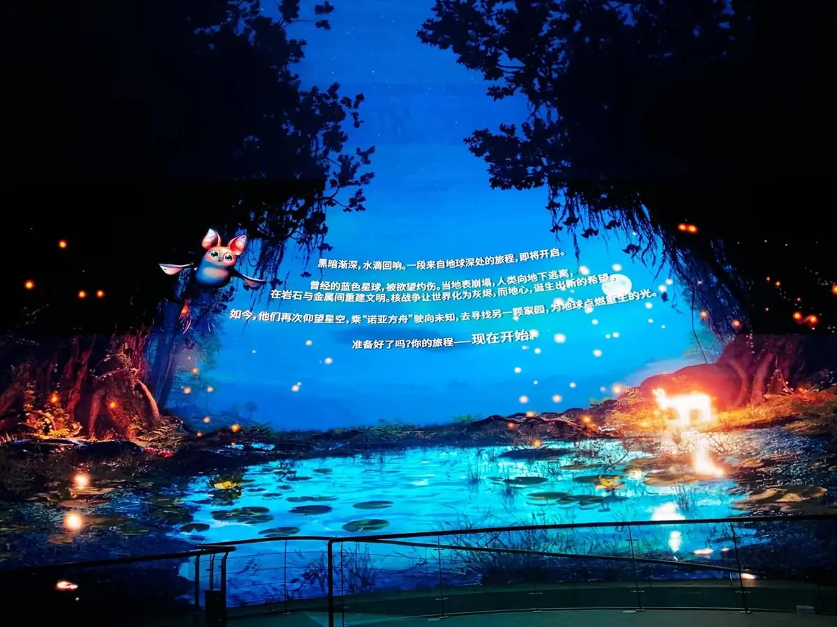
Once eyes are adapted, a 1,200 nit surface reads as genuinely bright — and the spare output is spent on the moments that need it: a sunrise, an explosion, a rocket launch. Content is graded with that headroom in mind, so the dome can render contrast rather than flatten everything into one exposure.
There is a practical procurement lesson here. A dome specified only on nits will often be delivered with a content grade that runs everything at 60–70% to protect the audience's eyes, wasting the extra output and adding heat. A dome specified as a system — brightness, contrast, gray depth, uniformity — can run closer to its design point, which means the number on the quotation turns into what the audience actually sees. The screen architecture behind it →
Every nits figure has an electrical consequence, and in a sealed sphere that consequence becomes an HVAC problem too. Our screens draw 150 W/m² at 1,200 nit full white; kinetic floor screens run up to 210 W/m² because they are engineered to be walked on and washed with light.
Power scales with screen area, and screen area is set by diameter. A 5,300 m² sphere and an 8 m dome are not the same electrical conversation. Bringing in the load calculation at design stage avoids the classic retrofit problem: a dome that has to be run at reduced brightness because the building cannot feed it.
LED modules are efficient, but thousands of square metres of them in an enclosed sphere produce a real heat load. Our power boxes use aluminium profiles with a large-latch design for fast heat dissipation and easy service access, and the building's cooling strategy is agreed with the dome design — not after.
LED lifetime beyond 100,000 hours is not just a maintenance figure; it is an operating-cost figure. A screen that holds its brightness and colour for a decade does not need to be over-driven to compensate for degradation — which keeps the power curve flat for the life of the venue.
This is also why we publish the power figure with the brightness figure. A supplier quoting nits without watts is telling you half the story — and the missing half is the one your building engineer needs. How turnkey delivery covers power and cooling →
There is a second-order effect worth planning for: heat changes the screen's own behaviour. A screen that has been running for six hours is warmer than one switched on five minutes ago, and output shifts slightly with temperature. Calibration is therefore verified in the thermal state the venue actually operates in, and content scheduling is set so the screen reaches its working temperature before the first ticketed show rather than during it. Small operational habits like these are what keep a 1,200 nit screen looking like a 1,200 nit screen in year three. Calibration in the finished room →
| Project | Brightness challenge | How it is handled |
|---|---|---|
| Kongtong 60 m | 5,300 m² of screen with 8K canvas and an animated show programme | 1,200 nit with uniformity held across the sphere; power and cooling designed with the building |
| Huangshi 22 m / 28 m | Daytime park operation plus night shows | Brightness headroom for daylight, dark-scene discipline for evening programming |
| Changzhi 20 m | Snow and aurora content — bright whites and deep blacks in one frame | 16-bit gray plus 1,200 nit so both ends of the frame hold |
| Beijing 5–8 m | Small room, no blackout, must run all day | Bright output with low consumption — the format's key advantage |
Across all of them the same rule applies: brightness is specified against the venue's content and building, then verified on site. Pitch → · Resolution → · Talk to the dome team →
When you compare suppliers, ask for three figures together — nits, contrast ratio and power per square metre at full white — and ask how the screen is graded in daily operation. A supplier who can give all four is describing a system. A supplier who leads with nits alone is quoting a lamp, and the audience in a dark sphere will notice the difference within the first thirty seconds of the first show.
Because in a dome the audience's eyes are adapted to a dark room, and brightness without contrast control becomes glare, not clarity. Pushing nits up also raises power and heat: our screens draw 150 W/m² at 1,200 nit full white, and that figure is what a building's electrical and cooling design has to carry. The right target is the brightness that serves the content with headroom to spare, not the largest number available.
Bright enough to run vivid daylight scenes and bright enough that the dome does not require blackout conditions to look alive, while still leaving dark scenes genuinely dark. For comparison, a typical living-room television is a few hundred nits; a 1,200 nit LED dome delivers far more light across a surface far larger than any screen in the building.
It changes the black level, which in dome content is most of the frame. Starfields, night skies and underwater scenes are dark images with small bright features; high contrast keeps those features punchy while the background stays deep. Low contrast turns the same scene into grey haze — the single most common reason a technically "bright" dome looks flat.
16-bit gray processing means the screen can render thousands of steps between black and a low mid-tone instead of a handful. Dome content lives in those steps: gradients across a sky, the falloff of a nebula. Without the depth, smooth gradients become visible bands — and banding is far more damaging in a dome than a slightly softer image, because it reveals the screen as a grid of modules.
Yes, directly: consumption scales with screen area and brightness. A large sphere at full white is a serious electrical load, so power and cooling are designed with the building, and content is often graded below peak — which is exactly the headroom a 1,200 nit screen preserves. Compact domes, by contrast, draw so little that they run all day without special provision.
Send your venue drawings, dome diameter and content plan — our engineers reply within one business day with a tailored configuration.
Get a Free Quote